HO CL Spread Trading in Unfair Advantage
This document clarifies a Starter Pick example. Please check out the Start Pick if you want to know how this example was found, and how it was validated.
For those with an
Unfair Advantage
subscription, we can continue our study using the Unfair Advantage
Correlation Chart. Open Unfair Advantage, and click on the menu
button for the Correlation Chart.
This opens the "Correlation Chart Preferences Dialog":
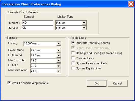
The first and second market and
amount
of history are all the same as from the website. The remaining
Settings are system parameters which will be explained later. The
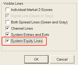
Visible Lines check boxes allow you to control which system lines are
displayed. Displaying all of the lines at once is too
confusing. The Individual Market Z-scores are the blue and red
lines from the website. The Signal Line which may be green or
gray is the same as the website. The Channel Lines shows the
relevant recent range of the Signal Line as used by the Correlation
Channel Breakout System. The system's entry and exit prices may
be displayed allong with the simulated equity curve.
The remaining preference "Walk
Forward
Computations" is important. On the website, all calculations are
"Full Period" rather than "Walk Forward". "Full Period"
calculations give you the clearest view of the current situation, but
do not reflect how historical situations would have been seen at the
time. For example, the correlation between a pair of markets
varies over time. A pair which is strongly positively correlated
today may not have been strongly correlated at some points in
past. The pair may even have some historical periods where they
were negatively correlated. As a result, a "Full Period" chart
will show a green Signal Line since the markets are positively
correlated from our current perspective, but a "Walk Forward" chart may
show segments of green and gray Signal Lines with gaps. Since we
are interested in correlations which reflect underlying economic
relationships, we are not interested in trading during time periods
where the correlation is not fairly strong and consistent.
Once you press OK, you get a
Correlation
Chart:
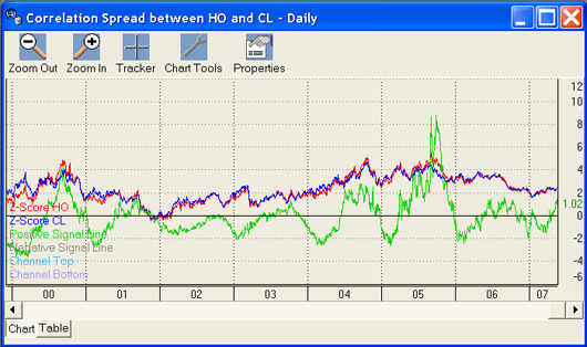
This chart should look familiar
since it
has the same lines as the website correlation chart. One thing
which may confuse you is that the red and blue may be reversed.
On the website, the requested pair are sometimes reversed to get the
red for sell and blue for buy coloring. This is very handy for
assessing the current situation, but is not helpful when analyzing the
history where the markets criss-cross over each other. The
Correlation Chart within Unfair Advantage always has the first market
in red and the second market in blue. This can be seen in the
legend in the lower left. "
Z-Score
HO
" is red; because, HO was the first system entered.

The Correlation
Channel Breakout
System
uses a look-back period of 25 days (Enter Period and Exit Period) to
determine the range of values the Signal Line currently occupies.
This is used to judge the likely times to enter and exit a trade.
For example, in 2004, we have two potential big trades. One
worked out, the other didn't.
To see how this works, press the Properties button on the chart itself:
Then check "Channel Lines"
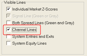
and press OK. The Channel
Lines
are sometimes spotty and sometimes strong:
Spotty |
Strong |
Spottiness happens when the
markets are
criss-crossing each other (a sign of market efficiency), or because the
correlation coefficient is waffling around at a low level. When
the Channel Lines are spotty, we want to avoid trading the
system. To help us, we have two settings:

The "Min Z to Enter" preference tells the system to ignore entry
signals when the the Signal Line is below some threshold. Judging
an appropriate threshold will be discussed later, but 1.6 is a
reasonable place to start. The "Min Correlation" preference tells
the system to ignore entry signals when the correlation drops below a
threshold. In this case, the threshold is 70%. The system
will only simulate a trade when the correlation is greater than +70% or
less than -70%. 70% is a reasonable number, but some people
require as much as 90% before they are willing to risk their
money. The important thing is for the correlation coefficient to
be consistent over time as saw on the website:
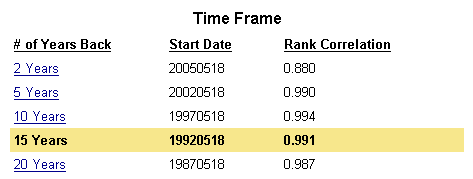 |
88% is a bit lower than the other
time
periods, but this is, overall, a modest amount of variation.
We have discussed the Channel
Lines,
what makes them sometimes spotty, and how to avoid trading during
spottiness. This leaves us clear to discuss what to do when the
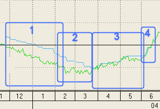
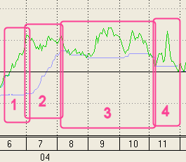
Channel Lines are strong. Back in 2004, we have two strong swings
out of alignment for these markets.
 |
|
 |
|
In the two trades in 2004, both
made a
profit eventually. The first trade had little volatility while
the profits flowed in while the second trade would have scared most
traders as the trade took us into much deep open-equity loses then our
expected final profit. There are two things we do to try to avoid
these high volatility trades. The first thing is to avoid trading
when the Signal Line isn't very large. The "Min Z to Enter" value
of 1.6 would have kept us out of this trade since the value was down to
1.4 when the Channel Line was touched. By choosing large values,
we have more statistically significant mispricing. These should
be more confident trades, but fewer to pick from.
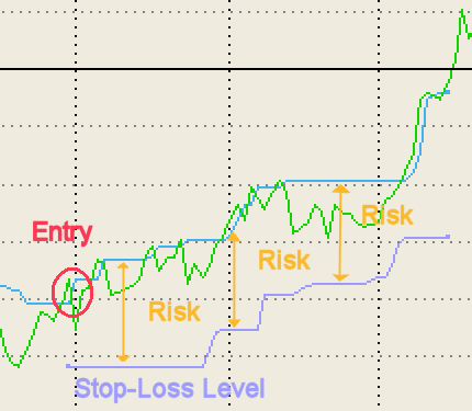
The second thing that we do to
avoid
high volatility trades is to employ a stop-loss using the other Channel
Line. If the Signal Line is below the zero line, then we are
using the recent high for our entry signal, and we can use the recent
low for our stop-loss signal. This does not guarantee us that we
will only lose exactly that much, but it gives us an objective measure
of how much risk we are taking with the trade and an objective point to
say that the correlation is still in the Creation stage and has not
Plateaued yet. By default, both of the Channel Lines are based on
a 25 day window. You can control each of the window sizes
separately using the "Enter Period
" and "Exit Period"
preferences. Some people prefer to use a
longer
"Enter Period" and a shorter "Exit Period"
.
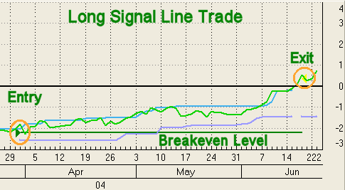
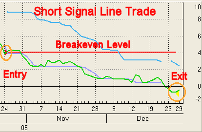
Profitable trades end by Signal
Line retracing to the zero level (shown in black.) The exact exit
level is chosen by the "Exit at Z-Score" preference. Here we have
used a value of 0.1. Since the actual trade is executed at the
next open, it doesn't have to be too precise, but if you make it too
small, the Signal Line can jump back into a new trade without you
taking your profit.
Now that we have
the Correlation Channel Breakout System described, we can take a look
at the results. If we click on the Properties button again, we
can add the Entries and Exits:

These appear as Red or Green
arrows to show the entry trade, and a Yellow arrow to show the exit.

Now that we have covered all of
the preferences and displays with the Correlation Channel Breakout
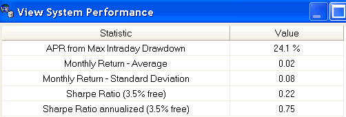
System, we can take a look at the System Performance Analysis
Statistics.
Right-Click on the chart and
choose "View System Performance Statistics".
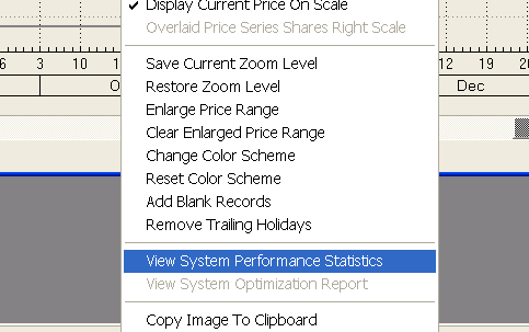
This will provide you with
detailed and general statistics.
For example, you can see the details of each trade:

And all of the system performance
statistics you would expected:
We have learn alot from this
example about how to use the software, and we have learned that the
spread between a finished good and its raw material can have tradable
misalignments.
When the supply chain is disrupted, extraordinary losses/profits can
result from this type of relationship.